For five days in July of 2010 I attended the Type Design Intensive course organised by the Department of Typography & Graphic Communication at the University of Reading in England. TDi is a highly compressed, microcosmic version of the successful one-year MA Typeface Design Programme at Reading, and offers participants a taster of the resources and expert tutelage of the core teachers on the MA Programme.
Many thanks to the teaching staff — Fiona Ross, Gerry Leonidas, Gerard Unger, Eric Kindel, Dan Rhatigan, Martin Andrews and Jo de Baerdemaeker. And also my fellow participants — Sofia Holmström, Luciano Cardinali, Gerrit van Bommel, Jussi Jokinen, Henrik Kubel, Julie Chauffier, Adonis Durado, Rana Rjelly, Sheikha Dhaher and Isabelle Kosciusko.
— Ben Archer
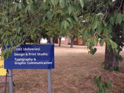
Entry to the Department of Typography & Graphic Communication.
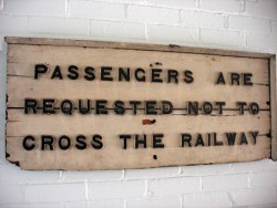
The department boasts an eclectic collection of historical signage that greets you on the way in.
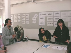
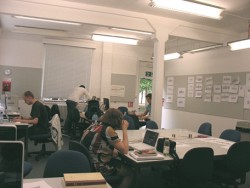
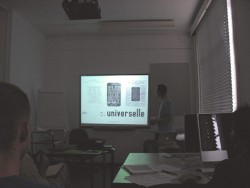
After Gerry Leonidas and Gerard Unger’s morning review of the preparatory activity, Fiona Ross addressed key issues in non-Latin type design with the class on Monday afternoon.
Getting down to work on Monday afternoon; the morning’s key question had been ‘can you see type design in Latin and non-Latin scripts?’ and the principal activity for the week was starting to design a text face. Many of us chose sans serifs.
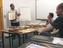
Part of Eric Kindel’s interesting lecture on stencilled typeforms on Tuesday evening.
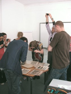
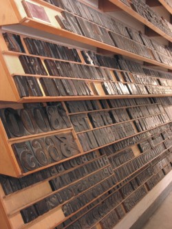
We had been told to bring cameras and pencils and got snap-happy over the historical type samples on Wednesday afternoon.
A moment from Gerry Leonidas’ lecture on the continuing story of Greek type design and typography on Wednesday lunchtime.
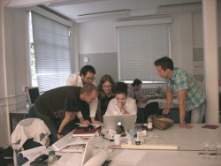
Intensive pizza-ordering to support the work-late ethic that saw us working on well after the evening lectures had finished.
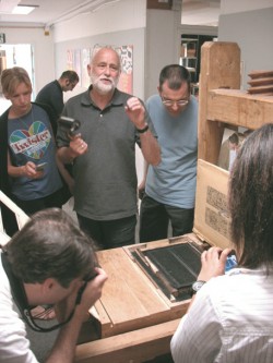
Thursday lunchtime, and Martin Andrews invites us all to have a pull on the Gutenberg facsimile press in the Department.
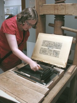
So Sofia Holmström inks up the block . . .
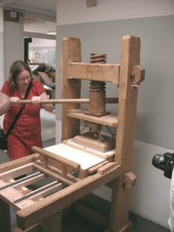
. . . and applies some pressure!
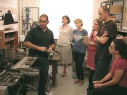
Gerry Leonidas talks us through the complexities of the Monotype caster on Thursday afternoon.
The technical implications of Monotype matrix manufacture – and how this affected both Latin and non-Latin type designs in the 20th century – was explained during the session.
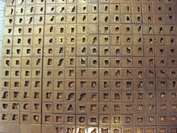
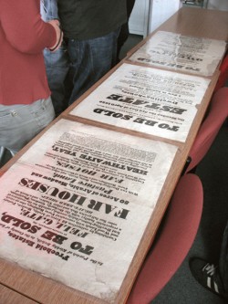
Part of the Department’s superb collection of historical woodblock printing types.
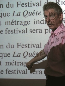
Gerard Unger gave a Thursday evening lecture on international differentiations in type design.
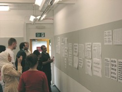
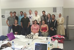
On Friday morning the crit wall and end-of-week review gave us all the chance to see how we had done with our various works-in-progress. This had been preceded by lectures on non-Latin type design and how Opentype technologies are allowing this field to flourish.
On Friday afternoon we had a more detailed look at parts of the departments’ extensive collections.
The end of a very rewarding week – three of us stayed on for further exploration and feedback in week two, and many of us will return for more in the future. Further images of the course are at http://typefacedesign.tumblr.com/
(Photo credit: Sofia Holmström)
This site uses cookies to deliver our services. By using our site you agree to our Privacy Policy